
Abstract
Environmental indicators are increasingly being used in policy and management contexts, yet serious data deficiencies exist for many parameters of interest to environmental decision making. With its global synoptic coverage and the wide range of instruments available, satellite remote sensing has the potential to fill a number of these gaps, yet their potential contribution to indicator development has largely remained untested. In this paper we present results of a pilot effort to develop satellite-derived indicators in three major issue areas: ambient air pollution, coastal eutrophication, and biomass burning. A primary focus is on the vetting of indicators by an advisory group composed of remote sensing scientists and policy makers.
Export citation and abstract BibTeX RIS

Content from this work may be used under the terms of the Creative Commons Attribution 3.0 licence. Any further distribution of this work must maintain attribution to the author(s) and the title of the work, journal citation and DOI.
1. Introduction
Environmental indicators and aggregate indices reduce complexity in policy-relevant ways, providing an important link between science and policy and helping to point decision-makers towards potential solutions to environmental problems. Indicators need to be able to separate the signal from the noise, to make perceptible trends or phenomena that might otherwise be lost in a sea of raw data (Hammond et al 1995). There has been growing research on the influence of environmental indicators and indices in policy and management contexts (de Sherbinin et al 2013, Unander 2005, Hezri and Dovers 2006, POINT 2011, Morse 2011), with findings showing that in selected contexts indicators can have a significant impact on framing issues and driving changes in policies and management practices.
Among many scientists raw monitoring data or scientific analyses are often taken as 'indicators' of environmental change. For audiences with sufficient technical expertise such data can be useful for day-to-day management decision-making. However, to be useful for higher level policy-making indicators need to be properly designed to indicate progress towards targets (desired outcomes) or to provide meaningful trends or comparisons. For example, indicators can help reduce complexity so that policy choices can be framed clearly; they can help identify a need for intervention through the analysis of trends or correlations with other indicators; and they can help discover potential sources of innovation by comparing across units. Indicators also help society to deliberate about desired futures and possible solutions to environmental concerns and they can drive action to tackle environmental problems. To achieve these goals, it helps to develop indicators for administrative units over which policy makers have responsibility. This generally requires the aggregation of spatial data to administrative units, normalization (by area or population), statistical transformation of raw data, and data reduction in order to improve communication and interpretation (OECD 2008, Ravenga 2005, Braat 1991). To further reduce complexity, indicators may be aggregated into composite indices to summarize status or progress across multiple environmental issue areas (e.g., Hsu et al 2014, Wackernagel et al 2002).
A major challenge for environmental indicator development has been persistent data gaps (Esty et al 2005, Hsu et al 2014). Satellite remote sensing has the potential to overcome these gaps by providing wall-to-wall coverage over decadal time scales for important environmental parameters (Esty et al 2005, Ravenga 2005). However significant barriers to the use of satellite data for indicator development remain. These relate to difficulties in accessing and using the data, differences between what satellites actually measure and parameters of interest to decision-makers, limited collaboration between the environmental measurement and Earth observing satellite communities to develop robust satellite-based indicators, technical issues such as cloud cover interfering with satellite data collection, and a lack of cross-cutting technical and funding resources (Hsu et al 2013, National Research Council 2007, Engel-Cox et al 2004). On top of these barriers are the gaps in the perception of 'readiness for use' and permissible levels of uncertainty between those in the remote sensing community who have the technical expertise to process remote sensing data, and those in the policy community who could benefit from the indicators.
We explore these issues through lessons learned from a project funded by NASA's Applied Sciences Program, which brought together stakeholders from the scientific and policy communities to explore the utility and readiness of indicators derived from remote sensing3 . The goal of the project was to develop a scientifically robust set of indicators that would help policymakers to make informed decisions and ultimately support policies and programs to protect the environment. The focus was on three application areas: airborne particulate matter concentrations, biomass burning, and coastal chlorophyll trends. In the remaining sections we describe the approach of using a cross-cutting advisory group (AG) to guide and vet indicator design, we briefly present indicator results in the three categories, and conclude by discussing perceptions by remote sensing scientists and policy makers on the readiness for use of the pilot indicators. Supplementary Online Material (SOM) provides a brief review of efforts to use satellite data for high-level decision making, additional details on the methods and results in the three application areas, and results of a survey of AG members.
2. Approach
Our approach began with the identification of environmental issues that command the attention of policymakers, are plagued by significant in situ data gaps, and had the potential to be developed into indicators using satellite data. An understanding of the issues of greatest salience and data gaps was garnered through more than a decade of collaboration by CIESIN and Yale University in developing the Environmental Sustainability Index (successive releases from 2000–2005) and the Environmental Performance Index (successive releases from 2006–2014) (Hsu et al 2014, Esty et al 2005). Identification of relevant satellite datasets drew on experience such as support for the Group on Earth Observations (GEO) in assessing satellite products to meet critical societal needs (Zell et al 2012).
The co-authors worked with an AG of policy experts, scientists, and remote sensing specialists. The AG included members from agencies using environmental indicators (The World Bank, Millennium Challenge Corporation (MCC), and the US Environmental Protection Agency (EPA)), academics specializing in the policy use of indicators, and remote sensing and subject area specialists based at the National Aeronautics and Space Administration (NASA), NOAA, universities, research institutions, and other government agencies (table 1). To ensure relevance to international stakeholders, a portion of the AG was from outside the US. AG members were selected based on their technical expertise, often through recommendations from peers, and with a goal of achieving a balance of membership across government policy and scientific agencies, international agencies, and academia; the air pollution sub-group was larger owing to pre-existing work by team members at CIESIN and Battelle (e.g., Emerson et al 2010 and 2012, YCELP and CIESIN (Yale Center for Environmental Law and Policy and Center for International Earth Science Information Network at Columbia University) 2011, Engel-Cox et al 2004).
Table 1. Advisory group members.
| Name | Organization | Area of specialty | |
|---|---|---|---|
| Policy | Jane Metcalfe | EPA Office of International Affairs | Air pollution, international decision-making |
| Steve Young | EPA Office of Environmental Info. | Environmental indicators | |
| Glenn-Marie Lange | World Bank, Environment Dept. | Environmental policy and indicators | |
| Thomas Bauler | Free University of Brussels | Policy influence of indicators | |
| Andria Hayes-Birchler | Millennium Challenge Corporation | Indicators as a selection criteria for development aid disbursement | |
| Air Pollution | Jill Engel-Cox | Battelle | Air pollution remote sensing |
| Ana Prados | Univ. of Maryland Baltimore Campus | Air pollution remote sensing | |
| Dale Quattrochi | NASA Marshall Space Flight Center | RS apps for air quality and public health | |
| Aaron Cohen | Health Effects Institute | Epidemiology of air pollution health effects | |
| Greg Carmichael | University of Iowa | Air pollution remote sensing | |
| Randall Martin | Dalhousie University | Air quality and biomass burning | |
| Jun Wang | University of Nebraska | Aerosols | |
| Daven Henze | University of Colorado | Particulates in Africa | |
| Pat Kinney | Columbia University | Particulates in Africa | |
| Darby Jack | Columbia University | Particulates in Africa | |
| Kelly Chance | Harvard/Smithsonian | Atmospheric remote sensing | |
| Biomass Burning | Louis Giglio | Science Systems and Applications | MODIS active fire data |
| David Ganz | The Nature Conservancy | Ecosystem impacts of fire | |
| Doug Morton | Goddard Space Flight Center | Emissions from biomass burning | |
| Luigi Boschetti | University of Maryland | MODIS active fire and burn scar data | |
| Coastal Water Quality | Ajit Subramaniam | Lamont-Doherty Earth Observatory | Ocean color, SeaWiFS applications |
| Mazlan bin Hashim | Technical University of Malaysia (UTM) | Coastal water quality, air quality | |
| Richard Stumpf | NOAA, Coastal Oceanographic Assessment, Status and Trends Branch | Harmful algal bloom forecasting systems |
The role of the AG was to identify relevant monitoring data and to vet methodologies and results for both scientific robustness and policy relevance, including a final written survey of AG members on the feasibility of satellite-based environmental indicators. With quarterly input from the AG, the project team assembled relevant remote sensing datasets, performed geospatial analysis, presented the results to agencies and decision-makers, and prepared final indicator data sets and recommendations. It should be noted that not every AG member in table 1 was involved at all stages; many of the scientists provided more input at early stages of methodological development, whereas the policy stakeholders were better represented during the indicator evaluation stage. This was not by design, but probably reflected preferences on the part of the different groups. We provide AG feedback on the individual indicators in the following sections, and review overall interactions and findings in the discussion section.
3. Air quality
3.1. Background
Poor air quality is a major concern worldwide. The World Health Organization (WHO) estimates that as many as 1.4 billion urban residents around the world breathe air with pollutant levels exceeding the WHO air quality guidelines. According to Lim et al (2012), outdoor air pollution is a major contributor to the global environmental burden of disease. The WHO indicates that it causes close to one million premature deaths worldwide each year, with particulate matter as a leading contributors (Ostro 2004). As such, air quality has garnered the attention of policymakers worldwide. While several air pollutants have adverse health effects, PM2.5 (microscopic particles less than 2.5 μm in diameter that lodge deep in the lungs) is widely recognized as the worst, owing to its potential to contribute to respiratory and cardiovascular disease in exposed populations.
Understanding air pollution levels, sources, and impacts is a critical first step in addressing air pollution problems (Hsu et al 2013). However, ambient air quality monitors are relatively sparse in many parts of the developing world, and even where they exist, only represent air quality conditions in the immediate vicinity of a monitor (Gutierrez 2010). There are significantly more pollutant monitors within North America and Western Europe (approximately 4100 monitors) than collectively in the rest of the world (Engel-Cox et al 2012). This disparity represents a significant in situ data gap in much of the developing world that hinders inclusion of air quality in global environmental indicators.
Satellite remote sensing air quality datasets offer the potential to fill that gap (Hsu et al 2013, Martin 2008). Based upon AG consultations, the project team focused principally on PM2.5, given the health impacts and recent advances in correlation of satellite data with surface level PM2.5 concentrations. (For a discussion of other satellite-derived air quality indicators proposed to the AG, see the SOM.) A primary satellite-derived dataset relevant to PM2.5 is Aerosol Optical Depth (AOD), a measurement of scattering of light between the satellite and ground surface. AOD is available from a number of satellites worldwide, including NASA's Moderate Resolution Imaging Spectroradiometer (MODIS) and Multi-angle Imaging Spectroradiometer (MISR) instruments on the Terra satellite. Numerous studies have shown that AOD is proportional to PM2.5 (e.g., Hoff and Christopher 2009, Weber et al 2010) and can be used as a surrogate dataset to fill the spatial gaps of ground-based monitoring networks.
3.2. Summary methods
Two related methodologies were developed for calculation of the air quality indicator. Here we briefly describe the first method, which relied on an existing dataset of satellite-derived surface level PM2.5 concentrations for 2001–2006 (van Donkelaar et al 2010) to craft a policy-relevant pilot indicator that accounts for population exposures and is geographically aggregated. Details on the second method, which used conversion factors from van Donkelaar et al to process time series particulate matter grids based on MODIS/MISR data, are presented in the SOM.
van Donkelaar et al (2010) generated a global, satellite-derived, annual average PM2.5 surface for the years 2001–06 based on level 2 (L2), daily MODIS and MISR satellite instrument AOD (figure 1). The results were validated against coincident and non-coincident ground-based measurements of PM2.5 with high levels of agreement. The geographic coverage of the dataset is nearly global with a horizontal resolution of 0.1° × 0.1°. Coincident aerosol vertical profiles from the GEOS-Chem chemical transport model, validated with CALIPSO space-borne lidar vertical profiles, were used to calculate daily conversion factors that account for the relationship between satellite column AOD and surface PM2.5 concentrations. The AOD–PM2.5 relationship varies spatially and temporally due to global and seasonal variations in aerosol size, aerosol type, relative humidity, and boundary layer height. The conversion factors were applied by van Donkelaar et al to the MODIS/MISR AOD data to estimate surface-level PM2.5 concentrations, measured in micrograms per cubic meter (μg m−3).
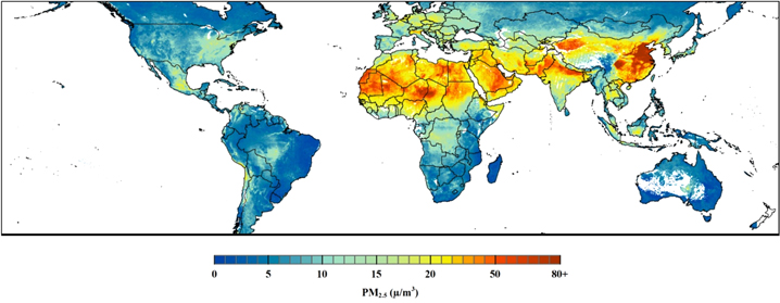
Figure 1. Satellite-derived annual average surface-level PM2.5 concentrations at 50% relative humidity, 2001–06 (map generated from data available at http://fizz.phys.dal.ca/~atmos/martin/?page_id=140).
Download figure:
Standard image High-resolution imageA population-weighting was applied to the surface-level PM2.5 concentrations in order to create an exposure indicator with human health policy relevance. Population weighting simply gives greater weight to PM2.5 concentrations in more populated areas than in less populated areas, thereby ensuring that measures tied to administrative units are not biased by large sparsely populated areas with relatively clean air. To implement the population-weighting, the fraction of the total country population within each grid cell of a country was determined using the Global Rural–Urban Mapping Project (GRUMP), v1 population dataset representing the year 2000 (Center for International Earth Science Information Network (CIESIN)/Columbia University, International Food Policy Research Institute (IFPRI), The World Bank, and Centro Internacional de Agricultura Tropical (CIAT) 2011). The population-weighted PM2.5 indicator was then calculated as the country sum of the product of the estimated PM2.5 concentration for a grid cell and the fraction of the population within that grid cell4 . The result represents an average concentration of PM2.5 to which a country's population is exposed.
3.3. Results
The results show patterns of PM2.5 concentrations above WHO guidelines of 10 μg m−3 annual average PM2.5, as shown by the colored areas in figure 2. High concentrations are found in several European countries, much of dryland Africa, the Middle East, and South and Southeast Asia. Particularly high average exposure is found in China (56 μg m−3, more than five times the WHO concentration guideline). One hundred out of 156 countries have concentrations above WHO guidelines for PM2.5. At the recommendation of the AG, average exposure was also calculated at province/state levels to highlight concentration differentials particularly within large, densely populated countries (SOM, figure 1).

Figure 2. Population-weighted annual PM2.5 concentrations by country (2001–2006).
Download figure:
Standard image High-resolution image3.4. AG review
The limitations of air quality satellite measurements include deriving surface-level concentrations from column measurements, understanding spatial patterns at scales finer than the native satellite spatial resolution (e.g., 10 km2 for daily MODIS AOD although 3 km2 products are becoming available), dealing with missing data, and maintaining continuity of measurements as satellites degrade and are replaced. While the team developed approaches to address most of these limitations, the AG felt that the satellite-based air quality indicators are more properly understood as a communication tool, and would not be useful per se in identifying mitigation strategies. This indicator does not have sufficient detail to support development of pollution control strategies since it does not address critical issues such as pollutant transport and chemistry. However, it should be noted that the use of the indicator for communication is consistent with our definition of a policy-relevant indicator.
AG engagement provided a number of additional insights on the suitability of satellite data for indicator development. The requirements for indicators to be scientifically rigorous, policy relevant, transparent, and sustainable underlie the suitability of satellite data (and particularly, air quality data) for environmental indicators. The two methods tested, the second of which involved using time series satellite AOD data with simplified assumptions, illustrate trade-offs among these criteria for alternate methods of applying satellite-based air quality data. Method 1 employs higher temporal and spatial resolution data than Method 2, more accurately capturing spatial and temporal variations in pollutant levels. Method 1 also relies on computing resources and knowledge of chemical transport models. Method 2 can be calculated by a geographic information system expert with internet access and a detailed methodology including a file of AOD/PM2.5 ratios and filters, and can be developed as a time series and routinely updated5 . Method 2 thus has higher sustainability in terms of lending itself to self-calculation by non-experts.
AG members cited the complex relationship between satellite-derived AOD and surface PM2.5 exposure—especially as it relates to disease risk—as a potential factor limiting indicator readiness. Also, one AG member noted that if the observation time of the satellite does not correspond to peak PM2.5 concentrations locally, then the corresponding satellite data may not provide the best representation of population exposure to air pollution. Although this problem may not be significant on a global scale, it should be addressed in future analyses to prevent potential misinterpretation or 'over-trusting' of the indicator results by decision makers who are not familiar with the details of the satellite dataset.
There are trade-offs between the use of satellite data and other forms of air quality monitoring and modeling outputs to support environmental indicators. Given that air quality monitors are relatively sparse in many parts of the developing world, satellite data helps fill a significant in situ data gap that hinders inclusion of air quality in global environmental indicators. The amount of labor required to operate a few monitors in a city is virtually the same as the labor required to calculate a satellite-based indicator for the entire world, on the order of a few hundred hours per year. Ground-based air quality monitors can cost tens of thousands of US dollars for initial purchase and several thousand US dollars for operation and maintenance. They also require well-functioning institutions and trained technicians to produce consistent, high quality data. Development of satellite derived estimates requires considerably less investment and expertise. Possible next steps are described in the SOM.
4. Biomass burning
4.1. Background
Biomass burning has a number of environmental impacts, including greenhouse gas emissions, health impacts from fire-related pollution (Johnston et al 2012), and ecosystem effects (Nepstad et al 1999). Some 20% of global emissions of greenhouse gases are due to fire activity (Bowman et al 2009), and the resulting emissions of black carbon are a major contributor to climate change and human health issues (Shindell et al 2012). Research suggests that climate change is contributing to an increase in fire activity in some regions (Westerling et al 2009, Flannigan et al 2009), resulting in a positive feedback loop of forest drying contributing to fires, which contributes to greenhouse gas emissions and ultimately more climate change and fires.
For the purposes of this indicator, it was assumed that most fire activity is either directly or indirectly due to human activity. An example of the former would be fires intentionally set to clear land for agriculture or to prepare land for cultivation, or accidentally set owing to failure to contain a fire in combination with drought conditions. An example of the latter would be forest fires produced by lightning strikes in areas where land clearing processes or climate change has resulted in a substantial alteration to the moisture content of the vegetative cover. Although the evidence for the human influence on fire activity is mixed (see for example Krawchuk et al 2009 and Le Page et al 2010), in the context of changing land use and climate conditions there is reason to believe that trends can be ascribed to human influences. For example, in a global assessment of fire activity, Chuvieco et al (2008) found a high association between population distribution and fire persistence. Therefore, our indicator focused on patterns and trends (spatial and temporal variation) in biomass burning with an emphasis on emissions and ecosystem impacts, with a goal of identifying countries with either increases or decreases in biomass-burning related emissions. Decreases in emissions would presumably signal countries that are improving their fire activity management over time, although the potential for major influence from short term climate variability or longer term climate change cannot be ignored as a contributing factor to fire activity. We address this in section 4.4.
4.2. Methods
For this indicator the AG recommended that we leverage prior work in assembling the Global Fire Emissions Database 3 (GFED3), a 13-year validated time series gridded emissions database (1997–2009) (van der Werf et al 2010). GFED3 is summarized on a half degree grid, though the emissions estimates come from higher resolution underlying burned area and active fire data. For the time period since 2000, more than 90% of the global burned area was mapped using MODIS 500 m resolution data. GFED3 emissions estimates (annual estimated tons of carbon per pixel) are further subdivided by fire type within every half degree cell: deforestation and degradation fires, savanna fires, woodland fires, forest fires, agricultural waste burning, and tropical peatland fires.
The following steps were followed to create the indicators. We added total emissions from forest, deforestation and degradation, woodland, savanna, and tropical peatland fire emissions; we omitted agriculture waste burning because this reflects seasonal fires that tend to have low net carbon emissions (crops quickly grow back resulting in re-absorption of carbon dioxide from the atmosphere). In ArcGIS 10 we created annual grids of emissions for these biomass burning types. Using R, we produced a cluster map on a gridcell basis depicting areas where there is both high frequency and intensity (total) of emissions (results presented in SOM). We regridded the data set at 2.5 min (∼4 km at equator), so that it would better correspond to the CIESIN country boundary data, and then we produced total emissions by country and year.
4.3. Results
The country-based indicator of average annual emissions over the last five years of the time period shows very high emissions in the United States, northern South America, Central Africa, Australia, India and China (table 2). Figure 3 depicts emissions divided by land area. Among countries with temperate climates the US, Canada, Russia, and Australia are major emitters per land area, as are most countries with dense tropical forests with the exception of Liberia, Gabon and Congo-Brazzaville.
Table 2. Total biomass burning carbon emissions (excluding agricultural waste) by country (in million metric tons), average for the period 2005–2009 (top 20 countries).
| Country | Total carbon | Country | Total carbon |
|---|---|---|---|
| Brazil | 76 090 | Tanzania | 15 492 |
| Dem. Rep. of Congo | 49 680 | United States of America | 14 798 |
| Angola | 41 012 | Nigeria | 10 344 |
| Indonesia | 38 239 | Boliva | 10 113 |
| Sudan (North and South) | 37 429 | Myanmar | 9870 |
| Australia | 34 800 | Ethiopia | 9457 |
| Central African Republic | 32 714 | Cameroon | 8766 |
| Mozambique | 28 470 | Chad | 8686 |
| Zambia | 27 878 | Madagascar | 8422 |
| Canada | 20 072 | Ghana | 6809 |

Figure 3. Total biomass burning carbon emissions (excluding agricultural waste) per 1000 sq km land area by country, average for the period 2005–2009 (mapped in deciles).
Download figure:
Standard image High-resolution imageWe sought to determine if there were significant trends in country level emissions over the ten year period. We could not identify any significant trends in the slope of ton of carbon emissions by year given the small sample size (n = 10), but there are a number of countries that saw large percentage increases and decreases in emissions when comparing the first half of the period to the second half (figure 4). Brazil, Peru and Bolivia saw large increases of 37%, 20%, and 73%, respectively, presumably owing to recent droughts and increases in forest fire activity in the Amazon Basin over this period. Algeria saw a near doubling in emissions. Much of South Asia is also a hotspot of increased burning between the two time periods.

Figure 4. Percent change in biomass burning emissions (excluding agricultural waste) per land area between 2000–2004 and 2005–2009 (mapped in deciles).
Download figure:
Standard image High-resolution image4.4. AG review
An original goal of this indicator was to determine which countries are improving their fire management over time, as signaled by declining emissions. This goal turns out to be difficult to achieve. Although human land management activities are indeed important and can affect overall emissions, year-on-year variations are more likely to be driven by climatic factors. In work not presented here, we sought to identify statistically significant trends in emissions, but given the short time series (n = 10) and high inter-annual variability, very few countries had significant trends. The percent change map (figure 4) could be used to conduct further analysis regarding the possible impact of management, positive or negative. Normalizing emissions by rainfall could potentially result in an indicator that more effectively identifies areas where land management activities are contributing to increasing trends. One additional issue with the trend approach is that forest burning depletes forest biomass, so there may be an upper asymptote beyond which biomass burning tends to level off. In other words, declining emissions could mean a country has largely been deforested.
A second goal of pinpointing areas of high biomass burning for policy attention was partially accomplished, though it would be good to use the cluster analysis results (presented in the SOM) in combination with information on the type of fire activity (forest, agriculture, peatland, etc) to identify fire 'hotspots' that might link to potential policy responses. This relates to a critique by the AG, that the indicator conflates a number of separate policy issues, including deforestation and land degradation (in some cases not sustainable); sustainable agriculture and land use processes; and peatland burning. It also does not adequately address the nature of burning activity in geographically disparate regions such as the boreal and tropical forests. The types of burning and locations where burning is taking place will require different policy responses, and the degree to which the indicator is relevant to a policy process depends on separating these out.
Overall, the AG identified this as an indicator with high salience (owing to concern over GHG emissions) and high robustness that was ready, once some of the above issues are addressed, to be applied in policy contexts.
5. Coastal water quality
5.1. Background
The flow of nutrients into coastal waters from land-based sources has seen a worldwide increase over the last decades (Boesch et al 2009, Glibert et al 2008). A 20 year analysis (1980–2000) of Coastal Zone Color Scanner (CZCS) and Sea-viewing Wide Field-of-view Sensor (SeaWiFS) data found dramatic increases in global average chlorophyll concentrations of close to 22%, particularly in the southern hemisphere and intertropical regions (Antoine 2005, Antoine et al 2005). The resulting change in water quality has many potential impacts on coastal and marine ecosystems. Phosphorus and nitrogen contribute to enhanced algae growth, and subsequent decomposition reduces oxygen availability to benthic sea creatures like fish, shell fish, and crustaceans. Changes to nutrient loadings can also change the phytoplankton species composition and diversity. In extreme cases, eutrophication can lead to hypoxia or oxygen-depleted 'dead zones' (Falkowski et al 2011) and harmful algal blooms, which have been spreading (Diaz and Rosenberg 2008, Kahru and Mitchell 2008, Glibert et al 2008). Yet in situ monitoring systems are even more sparse than for atmospheric pollution concentrations (EPA (US Environmental Protection Agency) 2008).
Given high variability in chlorophyll concentrations in the coastal zone depending on the type of coastal waters (e.g., estuaries or upwelling areas), and even within short distances in the same waters, it is not easy to determine a suitable target or threshold for 'harmful' chlorophyll concentrations similar to those that can be established for air pollutant concentrations. Furthermore, bottom reflectance can affect acquisition of ocean color parameters, rendering a snap shot in time relatively meaningless. Thus, in consultation with the AG, our approach to measuring coastal water quality was to measure trends in chlorophyll-a (chl-a) concentrations from 1997–2007, with the assumption that any increase in concentrations is likely to signal a negative change, which is consistent with the approach taken by others (Antoine 2005, Antoine et al 2005). While this assumption may not hold in every coastal area, on a global scale there can be little doubt that widespread increases would signal important changes in coastal water quality, which in turn may be related to patterns of eutrophication or harmful algae blooms. We further assume that changes in chl-a concentrations are due largely to land-based practices such as over-fertilization, inadequate sewage treatment, or other nutrient sources, all of which are amenable to policy responses. The degree to which this presumption is justified is further addressed below.
5.2. Methods
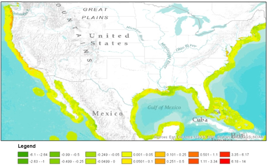
Based on recommendations from the AG, we focused on SeaWiFS Level 3 monthly data acquired from September 1997 to December 2007. The date ranges represent the most reliable period of SeaWiFS acquisitions; the sensor was launched in 1997 and after December 2007 the instrument's reliability began to decline. This work built on an earlier pilot efforts in 2007, which examined trends in coastal chlorophyll concentrations using annual SeaWiFS composites from 1998–2007 (Center for International Earth Science Information Network (CIESIN)/Columbia University 2009)6 . The annual composites were deemed to be unsuitable because of the oversampling during periods with low cloud cover and undersampling during periods of high cloud cover. It is known that periods of coastal upwelling in the Pacific Northwest, for example, are correlated with periods of higher cloud cover, and hence the sample from which annual composites are drawn is biased.
The work required a number of data transformations. We limited the spatial extent of the SeaWiFS data based on country's Exclusive Economic Zones (EEZs) out to 100 km based on EEZ boundary data from the Flanders Marine Institute (VLIZ) Maritime Boundaries Geodatabase. We eliminated grid cells with less than 45 observations over the 124 months, which effectively excluded many areas of constant cloud cover, especially in the northern latitudes. We also eliminated monthly averages based on <2 observations. We exported the data to IBM SPSS predictive analytics software and ran a regression of chlorophyll-a concentrations against year with dummy variables for each month to account for seasonal variability. The end results was a slope coefficient which measures change in chlorophyll-a by year, as well as a significance level for the slope.
5.3. Results
Figure 5 presents trend results for the United States and Mexico, while additional figures for China and the Mediterranean are presented in the SOM. All maps depict change in coastal chl-a in the form of slopes with chl-a as the dependent variable and year as the independent variable (controlling for seasonal variation with the month dummies). Declines in chl-a over the time period 1997–2007 are depicted in shades of green and increases in chl-a (potential problem areas) are depicted in shades from yellow to red7 . Although we were unable to perform a validation against external data sources, the results are nevertheless interesting. Several areas have seen significantly increasing trends in chl-a concentrations, including Long Island Sound, the Chesapeake Bay, coastal Texas, and much of the Pacific Northwest.
Figure 5. Slope of the trends in chlorophyll-a concentrations off the coast of the United States and Mexico, 1997–2007.
Download figure:
Standard image High-resolution image
5.4. AG review
Although pilot results were promising, the AG members representing the EPA and MCC found that this would not be easily used by their agencies because of the still advancing science on attribution and interpretation of results, and the high uncertainty in satellite-derived chl-a concentrations in near coastal regions. Ocean color sensors also detect colored dissolved organic matter (CDOM), and hence in areas experiencing heavy sediment loading increases, the signal needs to be interpreted differently. While AG members acknowledged that increases in chl-a and CDOM both signal declining water quality, addressing suspended sediments requires different policy responses than does reducing nutrient loads. Thus, more research would be required to understand patterns and specific causes (cf Beman et al 2005). For example, there were increases in the Chesapeake Bay, which is known to be influenced by nutrient loading from the Susquehanna and Potomac Rivers and urbanization (Kemp et al 2005), but large areas around the Mississippi Delta appear to have negative slope lines, which is somewhat counterintuitive.
The AG found that this indicator probably has limited relevance as a country-level comparative performance indicator. This is owing to the difficulties in (1) interpreting trends and attributing country responsibility for changes in coastal water quality, and (2) attributing changes to land-based activities. There is also no straightforward way to create a country level indicator representing the balance of positive and negative trends in the country's coastal area. Given a sufficiently long time series, one could conceivably measure the area of the coastal zone affected by 'negative' trends (positive slopes), but uncertainties are still high.
On balance, however, there was agreement among AG members that the map outputs can be useful for identifying changes that warrant further investigation, and may in some cases point to the need for policy responses.
6. Conclusions
One of the issues that the project team encountered is that the term 'indicator' had a broad range of meanings among AG members. Scientists tended to define indicators in terms of their ability to understand cause and effect relationships (i.e., being able to attribute environmental changes to certain causes), and evaluated them in terms of their levels of robustness and uncertainty. The concern is often to explain rather than to describe the patterns. Policymakers, on the other hand, may be satisfied with being alerted that a problem exists that needs to be further investigated. They also tend to trust indicators so long as they come from a 'credible source', and are more concerned about timeliness, salience (relevance to major issues at hand), and legitimacy (that the process for developing the indicator was transparent or results were peer-reviewed) (de Sherbinin et al 2013).
In the absence of a single defined purpose and target audience, input from scientists and policy-makers regarding the feasibility of the indicators developed by the project team reflected a range of preferences regarding accuracy, spatial resolution, comparability across regions, and level of aggregation. Scientific members of the project AG tended to focus on maximizing indicator accuracy without regard for the resources, processing costs, and ancillary datasets that are required to create a useful indicator. For the coastal water quality indicator, for example, scientific reviewers disagreed on data and methods, with some contesting and others endorsing the results. Users of environmental indicators, such as funding and project implementing agencies, tend to lack scientific expertise, so they rely on scientists to determine whether a given indicator is sufficiently robust—a situation that possibly puts more weight on the scientists' viewpoint than is necessarily warranted. Indeed, in the absence of any data an indicator may be fit for use that would not pass muster among scientific audiences. A proposed solution to these differing perspectives is to open a dialogue between scientists and policy-makers, such that the purpose and requirements of the indicator can be agreed upon upfront. Subsequently, scientists can then develop indicators that are 'fit for use' while maintaining necessary scientific rigor.
Decision-makers may still be understandably hesitant to rely on satellite-based indicators without comparisons to ground-based measurements in the general region of their focus, and thus, a concerted effort to produce ground-truth datasets will bolster the applicability of a satellite-based indicators. Ultimately, because decision-makers look to the scientists for assurance of whether the indicator is of sufficient accuracy, a clear message is needed from scientists on applications for which the indicators can and cannot be used. On maps or tabular reports, regions or countries with high uncertainty may need to be cross-hatched or omitted.
As seen by our three examples, different application areas and satellite products are at different stages of readiness for indicator development. It is clearly easiest and most scientifically defensible to develop credible indicators on the basis of established, peer-reviewed pre-processed remote sensing data sets. But this implies relying not only on the sensor's continued existence, but also on a well-funded research program based on those data. Indeed, an over-arching issue with regard to developing environmental indicators using satellite data is the sustainability of the underlying satellite dataset. Two of the trend indicators suffered from arbitrary baselines based on the start of the satellite record as well as short time series of 10–11 years. Yet by NASA standards these are long-lived missions. Although the culture is changing and there is greater concern for societal benefit areas, NASA traditionally developed satellite missions to support scientific research with little regard for long term operational uses. Operational satellites were left to USGS (Landsat) and NOAA (meteorological satellites). While cross-calibration has been successful in the ocean color domain to create long term data sets (e.g., Antoine et al 2005), this will not be possible in all domains. Thus, in general science teams are established with relatively short-term funding, which contrasts with the indicator community's need for long-term, consistent indicators. One possible solution is to develop indicator methods that are flexible and can be applied to new satellite datasets as they become available.
Results of the PM2.5 indicator for China and India garnered significant media attention when released in the 2012 and 2014 EPIs, including articles in the Economist, The New York Times, and many Asian newspapers8 , suggesting that there is an appetite for satellite-derived indicators if properly constructed and sufficiently innovative. The appetite may be greatest when the data confirm intuitions in regions where environmental data are poor or kept hidden (Hsu et al 2012) or when they raise awareness of an issue that has largely been ignored. Satellites, with their global synoptic views, are ideal in both cases.
Acknowledgements
This work was funded by the NASA Applied Sciences Program through grant number NNX09AR72G, led by CIESIN at Columbia University in collaboration with Battelle Memorial Institute. Additional support was provided by NASA contract NNG08HZ11C for the continued operation of the Socioeconomic Data and Applications Center (SEDAC). The authors would like to thank the advisory group members, CIESIN intern Chitra Vancutesen for SeaWiFS processing, and the comments of two anonymous reviewers.
Footnotes
- 3
The project's full title was 'Using Satellite Data to Develop Environmental Indicators: An application of NASA Data Products to Support High Level Decisions for National and International Environmental Protection.' The project represented a significant departure from the more technical applications of remote sensing for decision-support generally funded by NASA ROSES calls.
- 4
Due to the resolution of the satellite data, this calculation was performed only for those countries with an area greater than 200 km2, eliminating most small island countries and some city-states.
- 5
van Donkelaar et al (2013) have subsequently developed a time series of their own using improved modeling methods which were used in the development of two air quality indicators in the 2014 EPI (Hsu et al 2014).
- 6
In contrast to the air quality and biomass burning, it is important to point out that this indicator is not based on a peer-reviewed data set or a widely accepted methodology.
- 7
It is worth noting that the year after SeaWiFS launched, 1998, was an intense El Niño year, which may have had an effect on the observed trends in regions where El Nino is associated with warmer than normal surface temperatures, since particularly warm years would be expected to be associated with higher concentrations of chl-a.
- 8
The Economist, 1 February 2012, 'Pollution in China: Man-made and visible from space'.; Times of India, 30 January 2014. 'India's air quality among five worst'.